 Quasar
Transition (QTransition)
The Quasar Transition component (called QTransition) gives transitional animation behavior to any components or HTML elements, which are wrapped by it. It is basically a simplification of the Vue Transition Component. The transitions are used for entering (appearing) or leaving (disappearing) animations.
The animation effects are borrowed from Animate.css. So there are 12 general, 32 entering (In) and 32 leaving (Out) animation types currently available for you to use out of the box. Check the list either on Animate.css website or on the demo available for this page.
Basic Usage
To use QTransition component, simply wrap a component or HTML element with the transition component and add the necessary properties to it.
It’s also important that you import the CSS animation(s) from quasar-extra package as none will be supplied by default in order to reduce the footprint of your website/app.
Adding an Animation to the Bundle
In you Vue component where the template contains a QTransition or in src/main.js or src/App.vue (if you are using in multiple places), import the animations like this:import 'quasar-extras/animate/fadeIn.css'
import 'quasar-extras/animate/fadeOut.css'
// Or import them all -- but notice that your
// bundle will probably include unused ones,
// so more KB over the wire that never get used.
import 'quasar-extras/animate'
If you are building a website, you can also replace “quasar-extras” imports and use a CDN link which points to Animate.css like this (following is just an example, Google for latest link). Remember this will require an Internet connection for your user, as opposed to bundling from “quasar-extras”.<!-- index.html -->
<head>
...
<!-- CDN example for Animate.css -->
<link
rel="stylesheet"
href="https://cdnjs.cloudflare.com/ajax/libs/animate.css/3.5.2/animate.min.css"
>
</head>
Wrapping a Single Element
<!-- Example with wrapping only one DOM element / component --> |
Wrapping Multiple Elements
You can also group components or DOM elements in a QTransition so that the same effects are applied to all of them simultaneously.<!-- Example with wrapping multiple DOM elements / components -->
<q-transition
appear
group
enter="fadeIn"
leave="fadeOut"
>
<!-- We wrap a "p" tag and a QBtn -->
<p key="text">
Lorum Ipsum
</p>
<q-btn
key="email-button"
color="secondary"
icon="mail"
>
Email
</q-btn>
</q-transition>
Please note two things in the above example.
- The
groupproperty must be added to animate a group of components and/or DOM elements. - The components and DOM elements must be keyed, like
key="text"orkey="email-button"in the example above. - Both examples above have the Boolean property
appearspecified, which makes the entering animation kick in right after component(s) have been rendered. This property is optional.
Vue Properties
There are several properties within the transition component.
| Property | Type | Description |
|---|---|---|
appear | Boolean | Should the entering (In) animation occur right after rendering DOM / component? |
enter | String | The animation for transitioning into the screen. |
leave | String | The animation for transitioning out of the screen. |
group | Boolean | For transitions on a group of components or DOM elements. |
duration | Number | The time in milliseconds the transition should take. |
name | String | Used for custom animations, just like on the Vue Transition component. |
Note
Theenterandleaveproperties are necessary, for the transition to work properly, unless you specifynameproperty which tells QTransition to use a custom animation defined by your own CSS classes.
Vue Events
| Event |
|---|
before-enter |
before-leave |
before-appear |
leave |
appear |
after-enter |
after-leave |
after-appear |
You can use these events to control state, which controls the display logic.
Custom Animations
If the default animations supplied with Quasar are not enough, QTransition also allows you to specify custom animations defined by CSS classes in your website/app. This works much like Vue’s Transition component (which it wraps) when specifying the name property.
If you are only interested in using a custom transition, then it’s more efficient to use Vue’s internal
<transition>component. Adding this feature for QTransition is just for convenience so you can dynamically switch from and to an Animate.css animation to a custom one if you like.
Transition CSS Classes
Note. The following information (including the image) is taken from Vuejs official documentation for convenience, since QTransition is a wrapper for Vue’s internal Transition component.
There are six CSS classes applied for enter/leave transitions. Replace v with the name of your custom animation (which you will supply QTransition as name property).
v-enter: Starting state for enter. Added before element is inserted, removed one frame after element is inserted.v-enter-active: Active state for enter. Applied during the entire entering phase. Added before element is inserted, removed when transition/animation finishes. This class can be used to define the duration, delay and easing curve for the entering transition.v-enter-to: Ending state for enter. Added one frame after element is inserted (at the same timev-enteris removed), removed when transition/animation finishes.v-leave: Starting state for leave. Added immediately when a leaving transition is triggered, removed after one frame.v-leave-active: Active state for leave. Applied during the entire leaving phase. Added immediately when leave transition is triggered, removed when the transition/animation finishes. This class can be used to define the duration, delay and easing curve for the leaving transition.v-leave-to: Ending state for leave. Added one frame after a leaving transition is triggered (at the same timev-leaveis removed), removed when the transition/animation finishes.
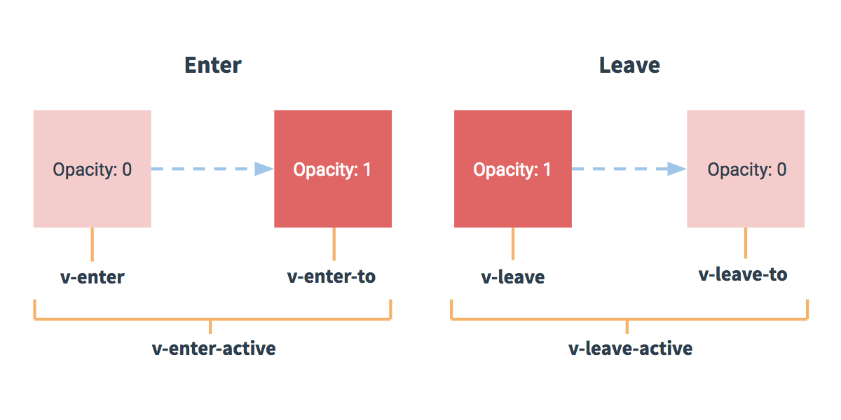
Each of the classes mentioned above are prefixed with v-, but if for example you are defining a custom transition named custom-anim then v-enter class would instead be custom-anim-enter (and so on for all others).
v-enter-active and v-leave-active give you the ability to specify different easing curves for enter/leave transitions.
Example of Custom Animation
<template> |